Digital infrastructure can be as critical as physical infrastructure, especially in the areas affected by the crisis.
In Ukraine’s context, prolonged armed conflict and the current economic situation make the establishment of new health facilities or the rehabilitation of damaged ones exceptionally challenging..
This article presents a cross-sectional study of internet access, which has a single aim:
Is it feasible to implement telehealth solutions in Ukrainian conflict-affected villages?
Background
Armed conflict in Ukraine has significantly disrupted physical access to healthcare, rehabilitation, and psychosocial support services, particularly in rural areas.
Digital health solutions might be an excellent supplement to the deployment of the mobile teams or, in some cases, even a standalone solution to the lack of service delivery.
However, successful implementation depends on two factors:
access to the internet and its utilization (infrastructure and resource domain)
The practical ability of beneficiaries to use basic digital services (skill domain).
Urban vs Rural
It goes without saying that the population of the largest Ukrainian cities has both access and capacity to utilize digital services, while rural conflict-affected communities are frequently perceived as excluded from such solutions.
This study was designed to assess this assumption empirically and to generate operationally relevant evidence for program design.
Methods
A cross-sectional controlled study design was applied. Data collection was conducted by mobile rehabilitation specialists (MRS) and psychologists as part of routine field activities.
Study population
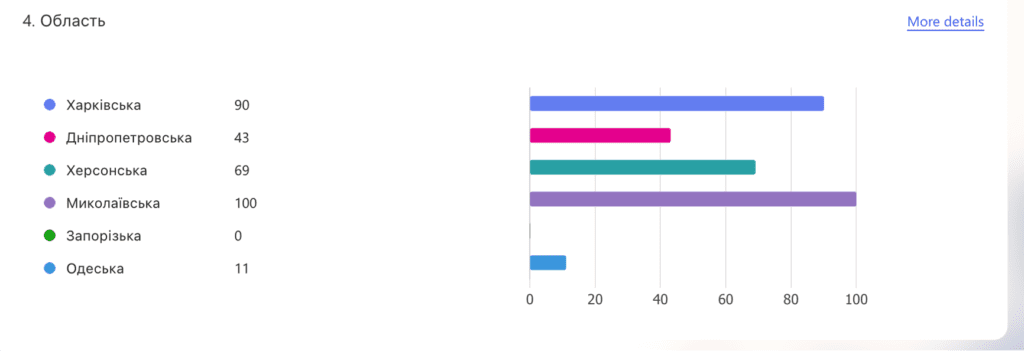
A total of 313 individuals were interviewed:
43 respondents from urban areas (control group)
270 respondents from rural areas (study group)
The study has been conducted across five oblasts: Kharkiv, Mykolaiv, Dnipro, Kherson, and Odesa city.
All areas included in the study were conflict-affected at the time of data collection.
Survey instrument
The assessment consisted of:
A structured 12-question questionnaire focusing on device ownership, internet access, and routine digital behavior
One practical task designed to assess functional digital skills
Practical test
Participants were asked to:
Receive a verification code via a messenger application
Enter the code into an official government website
This task was selected to reflect a real-world digital interaction commonly required for accessing public services.
Results
Access to internet-enabled devices
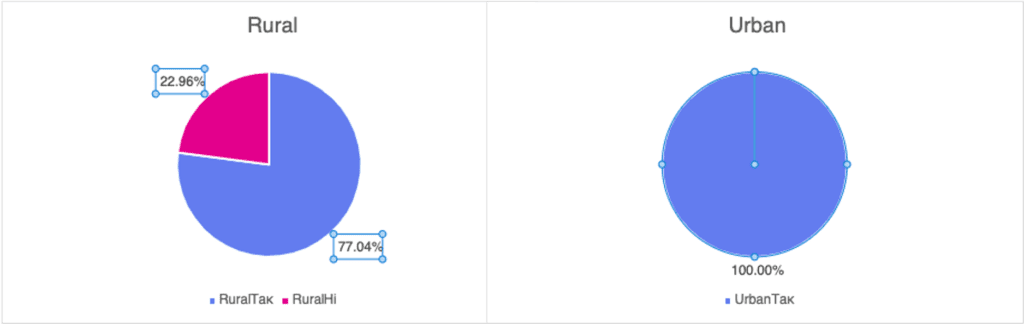
Rural areas: 77% of respondents reported having access to a device with internet connectivity
Urban areas: 100% of respondents reported access to such a device
In rural households, device access was frequently shared among family members rather than individually owned.
Use of messenger applications
Among those who had access to an internet-enabled device:
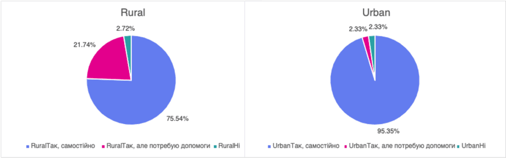
Rural areas: 75% reported regular use of messenger applications
Urban areas: 93% reported regular use
This indicates that once access barriers are removed, routine digital communication behaviors are broadly comparable.
Practical digital skills
Among participants who were able to attempt the practical test:
No meaningful difference in task performance was observed between rural and urban respondents
However, rural participants were more likely to be unable to complete the task due to:
Temporary lack of internet connectivity at the time of the interview
Absence of an internet-enabled device, as it is shared by several family members
Importantly, these barriers were related to access rather than to digital literacy or skill level.
Conslusion
Approximately four out of five rural respondents were able to access the internet, and a substantial majority were familiar with messenger applications.
This level of access provides a solid foundation for rolling out both asynchronous and synchronous digital health interventions, including telehealth, telerehabilitation, and telepharmacy services.
These findings support continued investment in remote service delivery models, including national initiatives such as the telepharmacy services launched by Ukrposhta Pharmacy in 2024.
Our team can tell with some confidence that with proper attention to the connectivity of the rural areas in Ukraine, telemedicine can play a pivotal role in reconnecting communities to health.
Electricity and power grid has been a commodity for almost 150 years with the advent of the light bulb motorised vehicles. Current AI revolution puts reliable and sustainable energy sources into the top spot.
Energy has been always a concern during the protracted armed conflict in Ukraine. The electricity stations and power grid have been suffered a barrage of attacks since early 2022 with single aim – to reduce Ukrainian economic output and disrupt the logistics and critical infrastructure.
To ensure the uninterrupted delivery of health services, most of the Health and WASH partners distributed, installed and connected reserve power sources, significantly improving the resilience of the healthcare system.
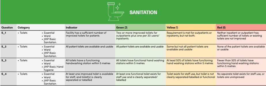
WASH FIT Assessment of Sanitation of 38 Health Facilities
Our project has trained and assessed 38 health facilities in conflict-affected regions of Ukraine using the WASH FIT methodology.
This article will outline the key findings of the Energy Domain and summarise the 3-year effort of the Health and WASH partners to ensure uninterrupted health services.
Sanitation Domain Analysis – Methods
We assessed the “Energy and Environment” of health facilities across 13 standard WASH FIT indicators, each of which is scored 0, 1, or 2 depending on the criticality of the issue:
0: Gap (Non-functional)
1: Partially addressed
2: Fully functioning
To get the relative final score, we devided absolute score by max value of 26 (13*2) and multiplied by 100% (as a percentage of the maximum).
For example, if the facility scored 13 points, the relative score is 50% (13/26*100%).
Analysis: Criticality and Context
We break down that percentage into three criticality categories:
Severe (<50%),
Moderate (50–70%),
Mild (>70%).
Looking at the first chart
The Energy and Environment as Worst and Best performing Domain
Finally, we contextualize against the other six domains in the WASH FIT assessment (such as water supply or sanitation). We analyze whether Energy lands in a facility’s “Top 3” or “Bottom 3” performing areas.
The Analysis leaves very little room for doubt:
Energy and environment has benefited from the collective efforts of the local and international NGOs and UN agencies in provision of reliable back-up power source.
It almost always ranks among the Top 3 best-performing domains across all geographical areas in Ukraine.
The bottom line:
When you assess the Energy domain with the WASH FIT tool, there is high chance it will outperform all other domains
WASH FIT Energy & Environment Analysis
WASH FIT Energy & Environment Analysis
Energy & Environment < 50%
0%
0 of 38 facilities
Energy & Environment in Bottom 3 Domains
0%
0 of 38 facilities
Energy & Environment Among Top 3 Best Performing Domains
0%
0 of 38 facilities
Energy & Environment Performance Distribution
Energy & Environment in Bottom 3 Domains
Energy & Environment Among Top 3 Best Performing Domains
Mean Scores by Domain Across All Facilities
Analysis Summary
• 0% of facilities (0 facilities) have energy & environment scores below 50%, indicating critical need for improvement
• 0% of facilities (0 facilities) have excellent energy & environment scores above 70%
• 0% of facilities (0 facilities) rank energy & environment among their bottom three performing domains
• 0% of facilities (0 facilities) rank energy & environment among their top three best performing domains
• The majority of facilities (0%) have energy & environment scores between 50-70%, showing moderate performance
As uninspiring as it could be as a topic of a blog post, the healthcare infrastructure plays a critical role in our lives. During a crisis, and beyond, public infrastructure is an excellent litmus test for the Government and Non-government organisations – can we finally pull the resources to reform and modernize?
First years of crisis, we saw an increased interest, from the NGO partners in the first place, to the critical infrastructure. There was a somewhat chaotic but non-theless well intented effort of half-a-dozen international organisations and local agencies in identifying the critical needs of healthcare facilities.
Somehow, almost all of them at some point in their implementation strategy focused on the washrooms and restrooms – from the provision of sanitary fixtures to the full renovation of the facilities.
WASH FIT Assessment of Sanitation of 38 Health Facilities
Our project has trained and assessed 38 health facilities in conflict-affected regions of Ukraine using the WASH FIT methodology.
This article will outline the key findings of the Sanitation Domain and summarize the 3-year effort of the WASH partners trying to cover almost 40-50 years of neglect.
Sanitation Domain Analysis – Methods
We assessed the sanitation of health facilities across 13 standard WASH FIT indicators, each of which is scored 0, 1, or 2 depending on the criticality of the issue:
0: Gap (Non-functional)
1: Partially addressed
2: Fully functioning
To get the relative final score, we devided absolute score by max value of 26 (13*2) and multiplied by 100% (as a percentage of the maximum).
For example, if the facility scored 13 points, the relative score is 50% (13/26*100%).
Analysis: Criticality and Context
We break down that percentage into three criticality categories:
Severe (<50%),
Moderate (50–70%),
Mild (>70%).
Looking at our first graph, the situation is largely manageable: less than 25% of assessed facilities fall into the “Critical” category (Relative score < 50%) with major gaps in their water domain.
The Sanitation as Worst and Best perfoming Domain
Finally, we contextualize against the other six domains in the WASH FIT assessment (such as water supply or sanitation). We analyze whether Sanitation lands in a facility’s “Top 3” or “Bottom 3” performing areas.
The Analysis leaves very little room for doubt:
The Sanitation domain still remains riddled with problems and continuous effort is needed to adress them in a more ssystematic way
It ranks in the Top 3 best-performing and Bottom 3 worst-performing domains, with pretty much average frequency, so it is difficult to see it as outliier like Waste Management or Energy and Environment domains.
The bottom line:
It is equally likely that you will encounter sanitation infrastructure in a critical state as it is to find a system where most pressing issues are sorted
WASH FIT Sanitation Analysis
WASH FIT Sanitation Analysis
Sanitation < 50%
0%
0 of 38 facilities
Sanitation in Bottom 3 Domains
0%
0 of 38 facilities
Sanitation Among Top 3 Best Performing Domains
0%
0 of 38 facilities
Sanitation Performance Distribution
Sanitation in Bottom 3 Domains
Sanitation Among Top 3 Best Performing Domains
Mean Scores by Domain Across All Facilities
Analysis Summary
• 0% of facilities (0 facilities) have sanitation scores below 50%, indicating critical need for improvement
• 0% of facilities (0 facilities) have excellent sanitation scores above 70%
• 0% of facilities (0 facilities) rank sanitation among their bottom three performing domains
• 0% of facilities (0 facilities) rank sanitation among their top three best performing domains
• The majority of facilities (0%) have sanitation scores between 50-70%, showing moderate performance
Sanitation, Water Supply, and Waste Management Domains
In today’s article, we will analyze the key findings of the Water Supply Domain.
Waste Management Domain Analysis – Methods
We assess sanitation facilities infrastructure across 20 standard WASH FIT indicators, each of which is scored 0, 1, or 2 depending on the criticality of the issue:
0: Gap (Non-functional)
1: Partially addressed
2: Fully functioning
To get the relative final score, we devided absolute score by max value of 40 (14*2) and multiplied by 100% (as a percentage of the maximum).
For example, if the facility scored 16 points, the relative score is 40% (16/40*100%).
Analysis: Criticality and Context
We break down that percentage into three criticality categories:
Severe (<50%),
Moderate (50–70%),
Mild (>70%).
Looking at our first graph, the situation is largely manageable: less than 25% of assessed facilities fall into the “Critical” category (Relative score < 50%) with major gaps in their water domain.
Waste Management as Worst and Best perfoming Domain
Finally, we contextualize against the other six domains in the WASH FIT assessment (such as water supply or sanitation). We analyze whether Waste Management lands in a facility’s “Top 3” or “Bottom 3” performing areas.
The Analysis leaves very little room for doubt:
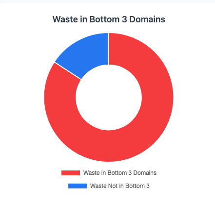
Waste Management is the most critical area of concern in Ukraine.
It frequently ranks in the Bottom 3 worst-performing domains, significantly underperforming across all geographical areas.
The bottom line:
There are 4-fold chances of the Water domain underperforms comparing to the domains such as Water Supply, Energy, and Enviroment, Environmental cleaning, or Sanitation.
WASH FIT Waste Management Analysis
WASH FIT Waste Management Analysis
Waste Management < 50%
0%
0 of 38 facilities
Waste in Bottom 3 Domains
0%
0 of 38 facilities
Waste Among Top 3 Best Performing Domains
0%
0 of 38 facilities
Waste Management Performance Distribution
Waste in Bottom 3 Domains
Waste Among Top 3 Best Performing Domains
Mean Scores by Domain Across All Facilities
Analysis Summary
• 0% of facilities (0 facilities) have waste management scores below 50%, indicating critical need for improvement
• 0% of facilities (0 facilities) have excellent waste management scores above 70%
• 0% of facilities (0 facilities) rank waste management among their bottom three performing domains
• 0% of facilities (0 facilities) rank waste management among their top three best performing domains
• The majority of facilities (0%) have waste management scores between 50-70%, showing moderate performance
Water Supply and Waste Management Domains
When you place water supply and waste management side by side, they read like mirror reflections. Water supply is very likely to come out ahead of other domains in WASH FIT studies, while waste management is four times more likely to fall behind the rest.
In today’s article, we will analyze the key findings of the Water Supply Domain.
Water Domain Analysis – Methods
We assess WASH infrastructure across 17 specific indicators, each of which is scored 0, 1, or 2 depending on the criticality of the issue:
0: Gap (Non-functional)
1: Partially addressed
2: Fully functioning
To get the relative final score, we devided absolute score by max value of 34 (17*2) and multiplied by 100% (as a percentage of the maximum).
For example, if the facility scored 25 points, the relative score is 73.5% (25/34*100%).
Analysis: Criticality and Context
We break down that percentage into three criticality categories:
Severe (<50%),
Moderate (50–70%),
Mild (>70%).
Looking at our first graph, the situation is largely manageable: less than 25% of assessed facilities fall into the “Critical” category (Relative score < 50%) with major gaps in their water domain.
Water as Worst and Best perfoming Domain
Finally, we contextualize Water against the other six domains in the WASH FIT assessment (such as sanitation or waste management). We analyze whether Water lands in a facility’s “Top 3” or “Bottom 3” performing areas.
The results we achieved are quite pronounced:
Water supply is consistently one of the strongest domains in Ukraine.
It frequently ranks in the Top 3, significantly outperforming areas like environmental cleaning and waste management.
According to our study, the 2-fold chances of the Water domain outperform domains such as Waste Management, Environmental cleaning, or Sanitation.
WASH FIT Water Domain Analysis
WASH FIT Water Domain Analysis
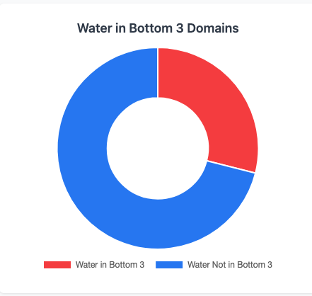
Water Supply < 50%
21.1%
8 of 38 facilities
Water in Bottom 3 Domains
10.5%
4 of 38 facilities
Water in Top 3 Best Performing Domains
31.6%
12 of 38 facilities
Water Supply Performance Distribution
Water in Bottom 3 Domains
Water Among Top 3 Best Performing Domains
Mean Scores by Domain Across All Facilities
Analysis Summary
• 21.1% of facilities (8 facilities) have water supply scores below 50%, indicating critical need for improvement
• 10.5% of facilities (4 facilities) have excellent water supply scores above 70%
• 10.5% of facilities (4 facilities) rank water supply among their bottom three performing domains
• 31.6% of facilities (12 facilities) rank water supply among their top three best performing domains, indicating water is not a major problem at these locations
• The majority of facilities (68.4%) have water scores between 50-70%, showing moderate performance
Infection prevention and control in healthcare facilities isn’t just about washing hands and following protocols—though those are crucial. The physical infrastructure of a facility can either support or undermine even the best IPC practices. Think of it this way: you can train staff perfectly, but if your building is working against you, you’re fighting an uphill battle.
In the previous article, our expert Nadiia already touched on the surface of the evidence-based infrastructure interventions that can genuinely strengthen IPC across different types of healthcare facilities.
This time, we come up with another 5 interventions focusing on IPC infrastructure, which patients and staff would interact with.
Fresh Air Isn’t Just Nice—It’s IPC Gold
Here’s something fascinating: a recent study led by Diana Bastien and Dusan Licina from research institutions in Denmark and Switzerland looked at what happens when you give people real-time feedback about CO2 levels in their spaces. They wanted to know if making people aware of air quality would actually change their behavior—would they open windows more often?
What does this mean for healthcare facilities? The devices they used ranged from fancy units with dashboards and big screens to super simple monitors that just alert you when CO2 is reaching unhealthy levels. For a primary care office or outpatient clinic, putting one of these monitors on the doctor’s desk could be transformative. It’s a great reminder for letting the room breathe and an effective tool for boosting the IPC.
Right now, improving natural ventilation is considered a top-priority intervention in many settings, sometimes even more effective than bactericidal UV lamps (especially if you don’t have radimeters to measure their efficiency). And it’s so simple. Just letting fresh air in can solve multiple problems at once.
When Fresh Air Isn’t Enough: Negative Pressure Rooms
Primary care facilities might do fine with better ventilation, but hospitals—especially those with infectious disease departments, TB centers, or surgical wards—need more robust containment strategies.
Every hospital in Ukraine should have a negative-pressure isolation capacity. These are specialized rooms where the air pressure inside is lower than the surrounding areas, which means air flows into the room, not out of it. Why does this matter? Because if you have a patient with a suspected or confirmed contagious disease—tuberculosis, COVID-19, measles, you name it—the contaminated air stays contained. It can’t drift out into the hallway or reach other patients.
The physics is straightforward: negative pressure compared to the environment means one-way airflow—in, not out. There are currently four main types of isolation rooms, two of which (Class N and Class Q types) are negative pressure.
These rooms aren’t optional infrastructure for modern hospitals. They’re essential for managing infectious patients safely, protecting both other patients and healthcare workers from airborne transmission.
Breaking the Contact Chain: Go Touchless to Bost IPC
One of the simplest infrastructure upgrades you can make is eliminating unnecessary physical contact points. Infections spread through touch—it’s one of the most common transmission routes, both for diseases patients bring into the facility and for preventing cross-contamination between patients.
The solution? Sensors everywhere:
Sensor-activated water taps (no more touching contaminated faucets);
Automatic liquid soap dispensers;
Touchless hand sanitizer stations.
These aren’t luxury items—they’re practical IPC tools, but Soviet era hospitals in Ukraine, which account for more than 80% of health facilities in the country, do not have them.
Patients and visitors appreciate these modern additions and rate facilities higher in both safety and quality.
The Heart of the Matter: Sterilization Service Departments
Now let’s talk about specialized care—multi-disciplinary hospitals, large regional facilities, and infectious disease centers. These places need a properly functioning Sterilization Service Department (SSD). This isn’t negotiable.
SSDs provide centralized reprocessing of medical devices. Without proper sterilization infrastructure, you’re putting patients at serious risk every time you use a reprocessed instrument.
Know Your Risk Categories
Medical devices fall into different risk categories based on how they’re used:
High-risk devices need complete sterilization:
Surgical instruments that penetrate tissue
Implants and prosthetics
Rigid endoscopes
Syringes and needles
Intermediate-risk devices need high-level disinfection:
Respiratory equipment
Non-invasive flexible endoscopes
Anesthesia equipment
Urinary collection bottles
Each category requires different processing levels, and your SSD needs to handle all of them correctly. The higher the risk, the more resources SSDs need to properly decontaminate and pack the equipment.
Here’s where infection control and accessibility beautifully intersect: automatic doors operated by infrared or motion sensors.
From an IPC perspective, automatic doors eliminate another contact point. No one touches door handles—which means fewer opportunities for pathogen transmission. This is especially valuable in surgery departments where maintaining clean hands is critical, or in high-traffic areas where door handles get touched constantly.
But there’s more. The Americans with Disabilities Act specifies that doors should open with minimal force—about 5 pounds (2.2 kg). Automatic doors blow past this requirement by requiring zero force. They’re a game-changer for:
Patients with mobility limitations
Healthcare workers transporting equipment
Anyone assisting or accompanying patients
Staff moving between areas with gloved, sterile hands
Think about a surgeon exiting an OR with sterile gloves—automatic doors mean they don’t have to compromise sterility to get through the doorway. Or consider a patient in a wheelchair navigating your facility independently. Automatic doors remove barriers on multiple levels.
This is infrastructure that solves two problems simultaneously: stronger infection prevention and genuinely improved accessibility. That’s an efficient investment.
Making It Happen: Practical Considerations
When you’re planning infrastructure improvements, keep these factors in mind:
Budget realistically: Interventions range from affordable (CO2 monitors, sensor faucets) to significant capital investments (negative pressure rooms, full SSDs). Prioritize based on your facility type and the populations you serve.
Maintenance plan: Every system needs ongoing care. Budget for service contracts, spare parts, and staff training from day one.
Train your people: New infrastructure only works if staff know how to use and maintain it properly. SSDs especially need personnel trained in international standards.
Validate and monitor: How do you know your systems work? Implement quality assurance—biological indicator testing for sterilizers, maintenance logs, and performance verification.
Phase it in: Limited resources? Develop a prioritized plan. Start with the highest-impact, most cost-effective interventions and build from there.
The Bottom Line
Infrastructure for infection prevention and control isn’t glamorous, but it’s foundational to safe healthcare delivery. A CO2 monitor in a primary care office, negative pressure rooms in a regional hospital, touchless fixtures throughout a facility, properly equipped SSDs—these aren’t extras. They’re the physical framework that makes effective IPC possible.
The evidence keeps growing: environmental controls and proper equipment don’t just complement behavioral measures—they multiply their effectiveness. In a world facing antimicrobial resistance and emerging infectious diseases, robust infrastructure isn’t optional.
Whether you’re planning a new facility or upgrading an existing one, think of IPC infrastructure as creating environments that inherently support safer care. It’s not about adding complexity—it’s about building intelligence into the physical spaces where healthcare happens. When the building itself works in favor of infection prevention, everyone benefits: patients, staff, and the broader community.
If you’re working in crisis response and you aren’t using WASH FIT yet, you probably should be. It’s one of the few tools out there that actually helps teams prioritize interventions alongside local leadership in health facilities.
And when it comes to infection prevention and control (IPC), prioritization is everything. You can’t fix everything at once. You have to know where risk is highest and which system failure will trigger the next outbreak.
That’s exactly what WASH FIT does well.
What is WASH FIT
WASH FIT is a tool designed to assess Health Facilities across 7 domains:
Water
Sanitation
Healthcare waste management
Hand hygiene
Environmental cleaning
Management and workforce
Energy and environment
Each domain includes between 5 to 20 indicators. Indicators are scored 0, 1, or 2, depending on the level of concern:
2 – No issues identified
1 – The issue is partially addressed
0 – There is a gap
WASH FIT and Ukrainian context
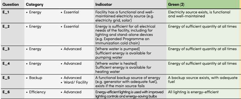
In the Ukrainian context, the Energy and Environment domain appears to be an outlier compared with the other domains
The first six indicators in this domain repeatedly ask about one major thing: “Are you getting enough energy to sustain a service delivery?“, which was a priority #1 for every program of Health System Strengthening during the first two years of this protracted crisis.
The next seven, although important, are not really relevant to the Ukrainian context, with the obvious exception of the ventilation indicator and the one assessing light in the delivery rooms. According to our expirience, the light in the delivery room depends on the presence of the reserve power source.
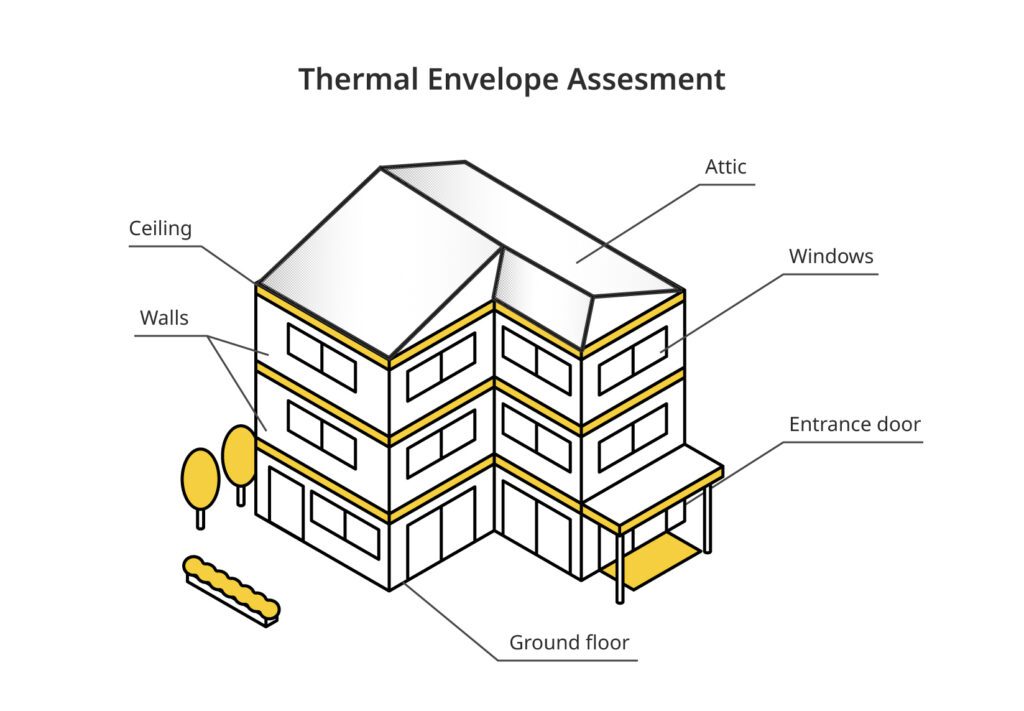
But the problem is not what these indicators in this domain ask about, but what they leave out. The thermal insulation envelope of health facilities is absent from the framework, despite being a key factor in maintaining indoor thermal comfort.
Humans can only be in the thermal comfort zone when heat production and heat loss are in balance (Kingma et al., 2012). In a thermally comfortable environment, no cold or heat should be experienced.
In the Ukrainian context, thermal comfort in health facilities can be defined by several factors:
Heat production – currently is not a part of the WASH FIT assessment.
Heat loss – assessment of the thermal insulation / thermal envelope. Not a part of the WASH FIT.
Ventilation – assessed by the WASH FIT.
Why the Thermal Envelope Assessment is not a part of the WASH FIT
Most countries where WASH FIT was originally applied intensively sit between 30° and -30° latitude.
But that’s not the case for countries like Ukraine, Kazakhstan, Tajikistan, and Lesotho, where the low average dips sub zero.
In the table below, among all countries where WASH FIT has been implemented, those located north of 30° or south of –30° latitude may face winter-related challenges in maintaining thermal comfort in hospitals and outpatient facilities, which can in turn increase the risk of certain infections.
Country
Coldest Month
Avg Temp (°C)
Southern Latitude (NH) / Northern Latitude (SH)
Kazakhstan ❄️
January
-10 to -5
40.6
Tajikistan ❄️
January
-2 to 0
36.7
Ukraine ❄️
January
-4 to -1
44.4
Lesotho ❄️
June-July
0-3
-30.7
Bhutan
January
4 to 8
26.7
Syrian Arab Republic ❄️
January
6 to 8
32.3
Jordan
January
8 to 10
29.2
Peru
June-August
8 to 20
-18.4
Iraq
January
9 to 11
29.1
South Africa ❄️
June-July
10-12
-34.8
Pakistan
January
10-12
23.7
Nepal
January
10-12
26.3
Tunisia ❄️
January
10-12
30.2
Lebanon ❄️
January-February
10-12
33.1
occupied Palestinian territory ❄️
January
11-13
31.2
Eswatini
June-July
12-14
-27.3
Ecuador
June-August
12-26
-5
Namibia
June-July
13-15
-28.6
Zimbabwe
June-July
13-15
-22.4
Egypt
January
13-15
22
Madagascar
July
13-16
-25.6
India
January
14-16
8.1
Malawi
June-July
14-17
-17.1
Bahrain
January
14-17
25.5
Zambia
June-July
15-17
-18.1
Rwanda
June-July
15-17
-2.8
Saudi Arabia
January
15-17
16.4
Ethiopia
November-December
15-18
3.4
Kenya
July-August
16-18
-4.7
Venezuela
December-January
16-27
0.6
United Republic of Tanzania
June-July
17-19
-11.7
Qatar
January
17-19
24.5
Viet Nam
January
17-20
8.6
Bangladesh
January
18-19
20.7
Mozambique
June-July
18-20
-26.9
Angola
June-July
18-20
-18
Uganda
June-July
20-22
-1.5
Lao PDR
December-January
20-22
13.9
Chad
December-January
20-23
7.4
Sudan
January
20-23
8.7
Myanmar
December-January
20-23
9.8
Niger
January
20-23
11.7
DRC
July
21-23
-13.5
Fiji
July-August
22-23
-20.7
Vanuatu
July-August
22-23
-20.2
Mali
January
22-24
10.2
Belize
January
22-24
15.9
Haiti
January-February
22-24
18
Comoros
July-August
23-24
-12.4
Gambia
January
23-24
13.1
Papua New Guinea
July
23-25
-11.7
Djibouti
December-January
23-25
10.9
Liberia
August
24-25
4.4
Ghana
August
24-25
4.7
Togo
August
24-25
6.1
Benin
August
24-25
6.2
Sierra Leone
August
24-25
7
Guinea
August
24-25
7.2
Guinea-Bissau
January
24-25
11
Jamaica
January-February
24-25
17.7
Somalia
July-August
24-26
-1.7
Nigeria
August
24-26
4.3
Burkina Faso
January
24-26
9.4
Cambodia
January
24-26
10.4
Indonesia
July-August
25-26
-11
Philippines
January
25-26
4.6
Sri Lanka
December-January
25-27
5.9
Maldives
December-January
26-27
-0.7
WASH FIT was implemented in the warm climate
The chart below summarizes the table and shows that only nine countries have an average temperature in the coldest month below 10°C, while in nearly 60 countries it remains above that level.
Countries by Coldest Temperature
Below 10°C: 13.24% (9 countries) ❄️
10°C and above: 86.76% (59 countries)
If we group countries by their geographic position and look at where colder winters occur, a clear pattern emerges. Countries located outside the ±30-degree latitude band are far more likely to experience cold winters. In fact, 5 out of the 9 countries in this group have noticeably colder conditions during the coldest month.
The picture is completely different for countries located between 30° North and 30° South. Here, the pattern flips. Only 4 out of 59 countries — less than 10% — experience colder winters in this zone.
Cold Countries Beyond ±30° Latitude
Below 10°C: 55.56% (5 countries) ❄️
10°C and above: 44.44% (4 countries)
Cold Countries Between 30°N and 30°S
Below 10°C: 6.78% (4 countries) ❄️
10°C and above: 93.22% (55 countries)
Integrating the Therma Envelope Assessment Checklist into the official WASH FIT tool
So our team put together a Thermal Envelope Assessment checklist that includes heat loss by the building and heat production by the heating system — everything from visually inspecting windows, doors, walls, ceilings, and attics to looking at how well a facility actually holds heat during winter.
In our view, these assessments are especially relevant for countries outside the ±30° latitude zone or where the average temperature of the coldest month drops below 10°C.
The idea is simple: this checklist and its indicators can be easily integrated into the official WASH FIT tool, specifically under the Energy and Environment domain, to make it more realistic for cold-climate settings.